
Official websites use .gov
A .gov website belongs to an official government organization in the United States.
Secure .gov websites use HTTPS
A lock (
) or https:// means you’ve safely connected to the .gov website. Share sensitive information only on official, secure websites.
Information Visualization
Summary
This project provides visualizations on an as needed basis in support of the larger Foundations of Measurement Science for Information Systems project. It aims to develop and evaluate a coherent set of methods to understand behavior in complex information systems, such as the Internet, computational grids and computing clouds.
Our goal is to help network researchers with insight to the functioning of the networking systems being investigated, primarily via a simulation. Visualizations of these complex simulations has provided, at a minimum a secondary independent method to ensure the proper execution of the simulations, and more fruitfully as an aid to insight about the simulation.
Description
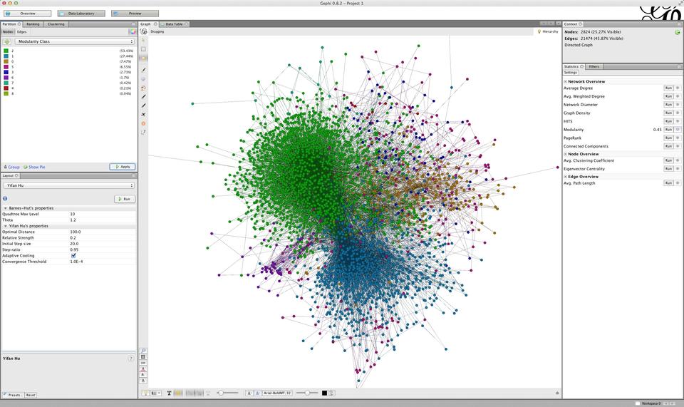
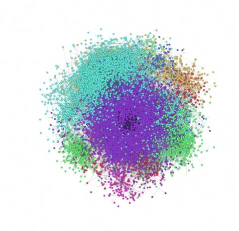
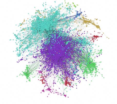
As an extension of earlier work we produced an animation of a network based on the 2001 configuration of the Autonomous System (AS) portion of the Internet, the team uses for study. The graph consists of approximately 11,000 nodes and 47,000 edges. Using an off-the-shelf open source tool called "gephi" we produced a number of visualizations that have helped give some structure to the network, which was completely unknown before seeing it. Data illustrated using gephi shown in the following figure was animated using alternate visualization parameters, see frames that follow. Colors correspond to data clusters using the "modularity" network metric.
|
|
We intend on using developments of the cloud computing simulation system and additional network configurations as the source for further visualizations that will impact the research process. We produced a number of visualizations using D3, a JavaScript based information visualization library, to visualize and compare genetic algorithms applied to cloud simulation data. These were done primarily by Mohammed Gueye, a SURF student during the summer of 2014. By using d3 a highly interactive toolset we were able to give the researchers choices about which simulation run to observe and to compare different sets, both topologically and via bar graph displays.
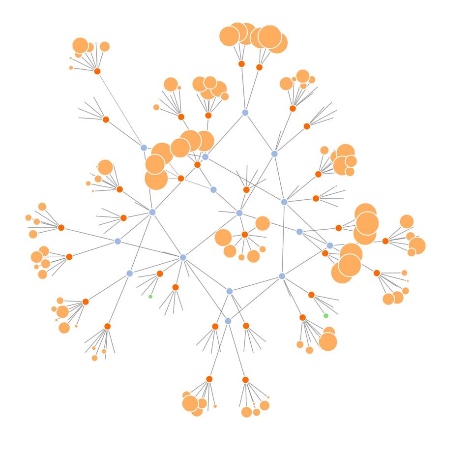
Continued work by Mills and Dabrowski has produced a network simulation that examines the role of realistic parameter changes as it affects the performance of a network. As part of work as a guest researcher from CSIRO in Australia, Phil Gough produced a D3-based interactive visualization tool for network simulation data produced by this simulation. This tool allows network researchers to look in a detailed manner at the results of simulations and to easily identify conditions such as network congestion.
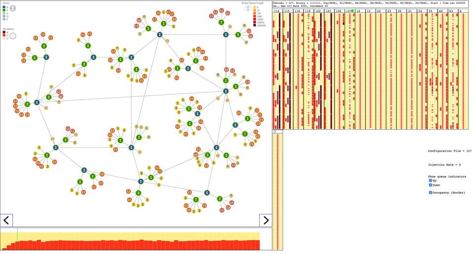
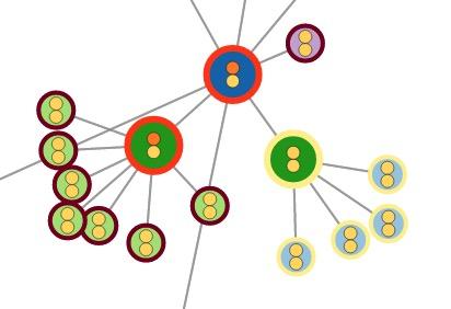
Topology on the left side of the display illustrates queue lengths and congestion state. Column type displays on the right side allows a user to select parameter input to simulation and displays congestion for each type of node group. The graph on bottom displays congestion and lets user step through the time of simulation.
A live demonstration of this tool is available here. Currently two datasets are available one with 250 time steps, the other with 3000 time steps; simply use the desired number in the URL.
|
|
|
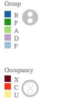
As illustrated in figure 2 there are five groups or types of nodes (indicated by color of interior of circle); Node congestion or occupancy is indicated by color of border of circle; Two small circles inside of node indicates queue length of up (top) or down (bottom) queue. In the future we expect to produce some additional animations based on this visualization and collaborate on an as needed basis with network researchers. This work was also part of Gough's research on communicating scientific results to non-scientists.
Publications
- K. Mills, C. Dabrowski, The Influence of Realism on Congestion in Network Simulations, NIST TN 1901.
- K. Mills, C. Dabrowski, J. Filliben, S. Ressler, Combining Genetic Algorithms & Simulation to Search for Failure Scenarios in System Models, Mitre Cyber Security Technical Center Distinguished Lecture, McLean, Virginia, October 16, 2013.
- K. Mills, C. Dabrowski, J. Filliben, S. Ressler, Y. Wan, Predicting the Unpredictable in Complex Information Systems, Joint University of Maryland and NIST Network Science Symposium, College Park, Maryland, January 24, 2014.
- K. Mills, C. Dabrowski, J. Filliben, S. Ressler, Combining Genetic Algorithms & Simulation to Search for Failure Scenarios in System Models, Computer Science Interdisciplinary Seminar, George Mason University, February 19, 2014.
- Gough, P., Comparing Visualisation Approaches to Communicating Science to Non-Scientists, ACM Siggraph, August 9, 2015.
Return to Visualization