
Official websites use .gov
A .gov website belongs to an official government organization in the United States.
Secure .gov websites use HTTPS
A lock (
) or https:// means you’ve safely connected to the .gov website. Share sensitive information only on official, secure websites.
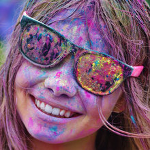
One of the goals of artificial lighting is to make things look natural. White light can make an otherwise appetizing sandwich look like garbage, if the reds and greens of the tomato and lettuce are washed out. On the other hand, a light containing too much red might make the tomato look lurid and unappetizing, like a plastic toy.
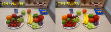
To hit the “sweet spot” between too dull and too vivid, lighting manufacturers rely on an international standard that helps them determine whether their white lights will render objects “correctly” – that is, the way they might look in sunlight. This standard is based on an old system called the Color Rendering Index (CRI), which scores lamps on their color fidelity: The higher the CRI score, the more natural objects should look when illuminated. A score of 100 is considered “perfect.” Most good white light lamps get scores of 80 or higher.
But just because something looks natural does not mean that people like it.
In fact, says NIST’s Yoshi Ohno, a scene illuminated with a lower-scoring white lamp can look better to viewers than the same scene illuminated with a high-scoring lamp. [see graphic below] Ohno and his colleagues wanted to study whether this was primarily due to the saturation of the colors that make up the white light itself.
All the Colors of the Rainbow
White light contains a kaleidoscope of colors, or hues, of light shining together. The way objects look depends on how their materials absorb or reflect these different hues. So the more colors are in your white light, the more information you have about the objects around you.
Daylight and incandescent light are broad-spectrum, meaning they contain many different hues – literally all the colors of the rainbow. White fluorescent bulbs and LED lamps, on the other hand, usually have spikier spectra, meaning they have fewer spectral components or hues.
Originally, the CRI metric was developed to evaluate the ability of fluorescent lamps to render colors “correctly” compared to incandescent lamps or natural daylight, which were considered ideal for lighting. The CRI worked well for fluorescent lamps. But fluorescent lamps have limited control over the saturation, or vividness, of the colors within the white. LEDs, on the other hand, can easily achieve higher saturations than specified by the CRI – and they may even be preferred by consumers – but manufacturers don’t tend to take advantage of that flexibility because the CRI metric tells them not to.
So the question for NIST researchers was: What do people like? Do they prefer higher saturations in their white LED lamps than the current standard recommends? In particular, are all colors equally important, or is bumping up the saturation for just certain colors important for people’s preference?
And could the lack of saturation in certain colors help to explain why some people, at least, don’t like fluorescent or LED lamps?
Seeing Red
Last summer, following an earlier experiment done in 2014, the NIST team – in collaboration with researchers from the Ulsan National Institute of Science and Technology (UNIST) in South Korea – set up an experiment to investigate the connection between the saturation of different colors and people’s preference.
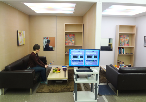
The tests were conducted at NIST’s Spectrally Tunable Lighting Facility, whose ceiling has LEDs that can shine in various combinations to make different kinds of white light. Subjects sat on a sofa and were asked to look at objects whose color they were familiar with – a bowl of fruits and vegetables, a can of soda, their own faces in a mirror – under different kinds of lighting. They were presented with the different types of lighting in pairs, one after the other, and asked which lighting they preferred in each pair.
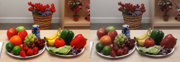
The lighting choices were varied based on the saturation or desaturation of three colors – red, green, and yellow – with three levels of saturation and desaturation – small, medium, large. Choices also included neutral saturations for each hue, representing the levels used in current lighting standards. The 19 participants were presented with every combination of saturations of the different colors to choose between, for three different tones of white light (warm to cool).
The researchers found that their test subjects had a strong preference for higher-saturation red – particularly the small and medium boosts – in their white lights compared to the standards set by the CRI. They also found that, to a lesser extent, people preferred more saturated green, as long as it was a relatively big boost. And they didn’t seem to care in any significant way about the yellow, whether it was saturated or desaturated. The finding was similar when the participants were looking at their own faces too.
A New Standard
Until now, a relationship between lighting hue and viewer’s preference had not been experimentally tested, Ohno says. The team is currently preparing to share their results with the international lighting community.
“I think many industry people are becoming aware [of this problem with color fidelity versus consumer preference],” Ohno says. Some companies have even begun making lighting products that bump up the saturation of certain hues in the lights they sell, though such lights still score lower on the current standard rating.
The final goal is to allow a new version of the CRI to remain as a “color fidelity” metric, but also to create a new standard for “color preference” to give companies further guidance for manufacturing LED lights. Companies could use one or both of these metrics depending on the intended applications.
The research is on-going, however, and more tests are needed before a recommendation can be made. For example, the 2016 study evaluated saturation only in red, green, and yellow due to limitations of the facility. Ohno is hoping to explore how saturation in more colors, including blue, may affect people’s preferences. To do that, researchers may try to bypass some of the technical difficulties associated with controlling the saturation of those colors by using images on a computer screen instead of real lighting in a real room.
“Right now making LED products with higher saturations of colors is discouraged, because of the CRI metric. The old standard is impeding the development of good products,” Ohno says. “We’re working to develop new standards for color quality of lighting products, and we need good scientific supporting data” to do that.
-- Reported and written by Jennifer Lauren Lee