
Official websites use .gov
A .gov website belongs to an official government organization in the United States.
Secure .gov websites use HTTPS
A lock (
) or https:// means you’ve safely connected to the .gov website. Share sensitive information only on official, secure websites.
Manufacturing Innovation Blog
Powered by the Manufacturing Extension Partnership

It is said that a picture tells a thousand words or in the words of Rod Stewart, every picture tells a story. So, I will limit the words and let the charts speak. Of course, if I was a better artist, you would be moved to see the story but you will have to deal with charts and graphs which is the art and currency of economics. Rather than spending a lot of time writing about these charts, I decided to just put them out there and let them speak for themselves. It is clear that manufacturing, like the broader economy, continues to experience muted and choppy performance. There appears to have been some significant slowdown over the summer in manufacturing and some indicators suggest an upward trend more recently. These five charts look at set of indicators regarding the health of manufacturing including employment, the Institute for Supply Management’s overall index for manufacturing, the Federal Reserve Board’s data on capacity utilization and industrial production in manufacturing, labor productivity in the manufacturing sector, and the value of exports and imports in goods over the most recent years. They represent different lenses from which to view manufacturing and its health.
Chart One: Manufacturing Employment and ISM Index
Manufacturing employment has grown by over 100 thousand jobs since January 2012 but employment has leveled off since the summer. The ISM PMI composite index fell over the summer as well but has shown some signs of picking up more recently.
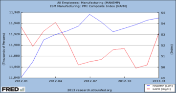
Chart Two: Production and Capacity Utilization in Manufacturing
Industrial production and capacity utilization started off the year strong, fell over the summer as did employment and the ISM PMI composite index, started to pick up in the fall, but then fell more recently. In addition, industrial production remains well below its pre-recession levels.
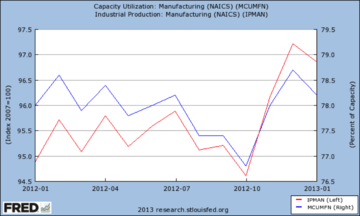
Chart Three: Manufacturing Productivity
Productivity grew over most of 2011 but has leveled off in 2012. Output per hour (labor productivity) in manufacturing has been little changed over most of 2012 which has historically been a bright spot for manufacturing. That may reflect some of the drop in industrial production noted in the prior chart.
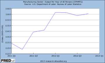
Chart Four: New Orders and Inventories
New orders for manufactured goods has been choppy and experienced a significant drop over the summer. Manufacturers appeared to deal with some of the fall off by working off inventories but inventories appear to have risen sharply over the summer and now are leveling off.
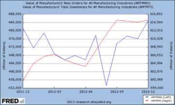
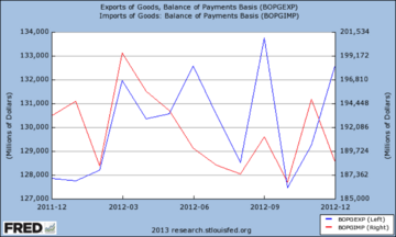
Chart Five: Exports and Imports of Goods
The value of exports and imports of goods looks positive. The total value of exports, while choppy, shows a general upward trend and the value of imports shows a downward trend. However, the value of imports still exceeds the value of exports by a large margin although the gap is narrowing.
How these trends continue to play out this year is at best a guess. The trends outlined here are confirmed by many other surveys done by the various regional Federal Reserve Banks across the country and provide somewhat contradictory signs regarding the future. There are some indicators that seem to be moving in the right direction while others seem to have hit the pause usa-button. Employment, the outlook of manufacturers, and the trade figures provide some positive signs. Productivity, capacity utilization, and production have seemed to level off although the trend in new orders and a leveling off in inventories seems positive for the future. However, there remain other issues including that may throw things off the rails including government policy, economic performance internationally, and other potential shocks that appear. I don’t know what to make of the picture other than to be guarded in my future outlook but positive. Let me know what you think the future may hold.
About the author

Related Posts
Comments
- Reply