Official websites use .gov
A .gov website belongs to an official government organization in the United States.
Secure .gov websites use HTTPS
A lock (
) or https:// means you’ve safely connected to the .gov website. Share sensitive information only on official, secure websites.
Taking Measure
Just a Standard Blog
If you’ve ever tried on clothing at a store only to have it look completely different at home, you know how much our eyes depend on lighting to help us see colors.
We also all interpret colors a little differently, even with the same lighting.
Remember the social media controversy over the color of a dress that everyone seemed to have a different opinion on? That’s a lighthearted example of how illumination can affect the things we see, but this is serious science. How our eyes see color under different conditions can affect such things as how health professionals read medical imaging scans.
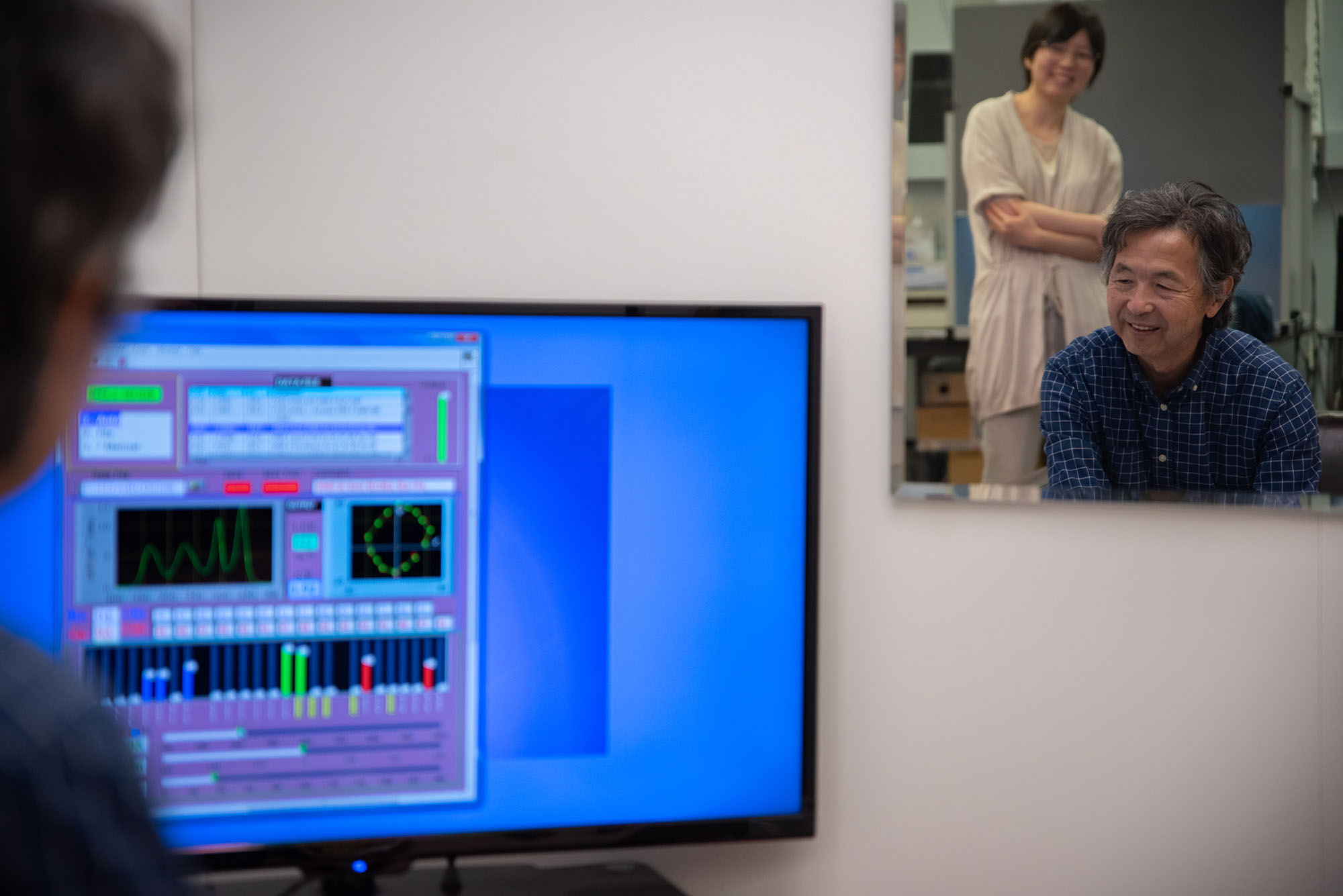
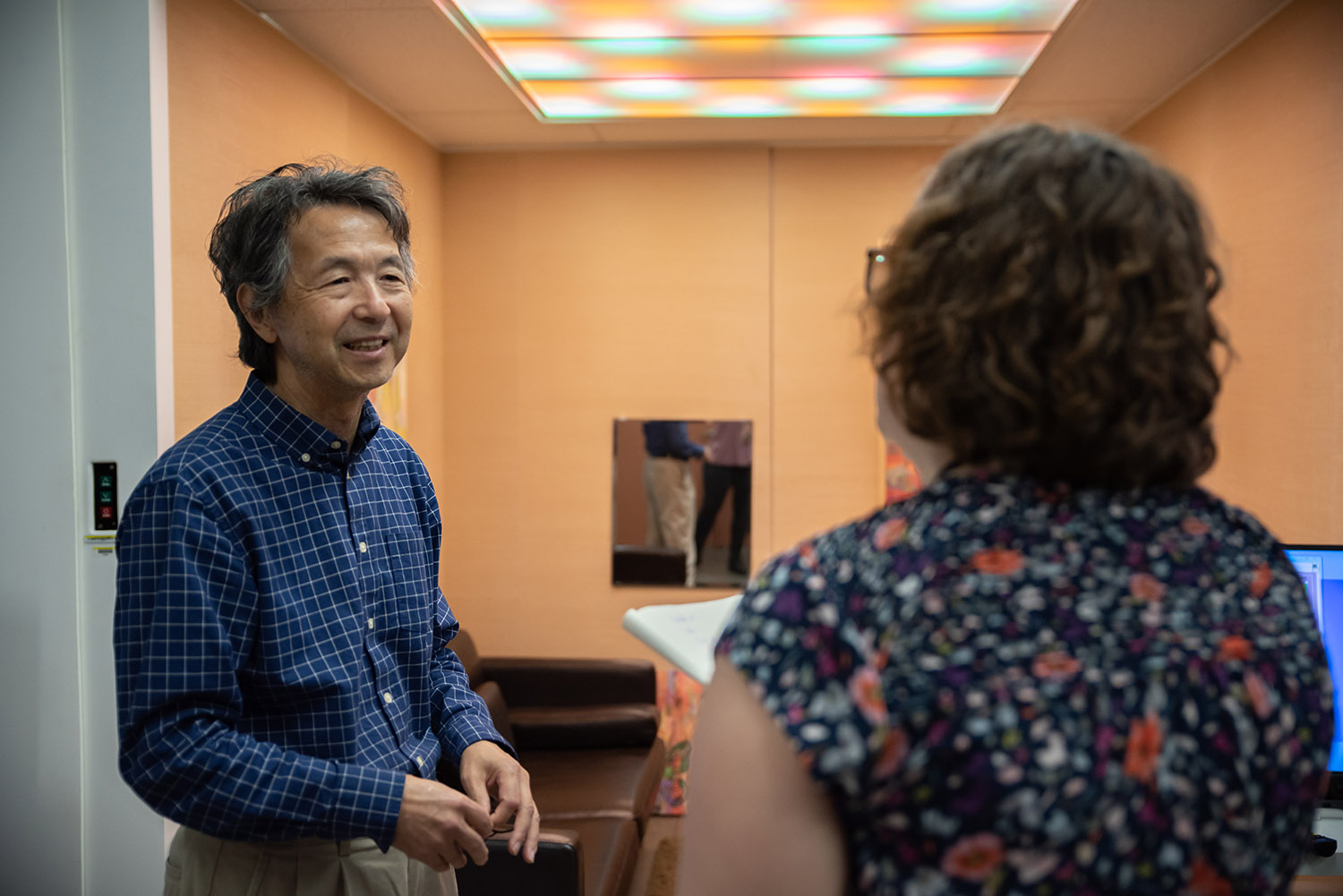
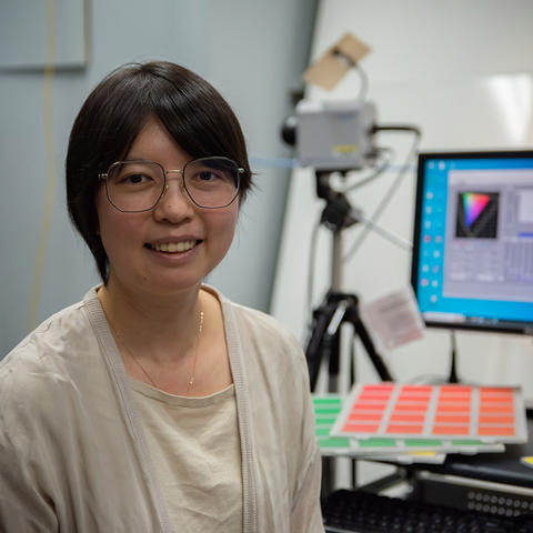
NIST researchers Yoshi Ohno and Jane Li study how LED lights affect our perception of color. Their research could someday inspire new international standards for the color quality of the lighting we use every day.
The Science of Color
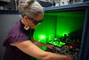
On a recent Friday afternoon, I visited the lighting lab at NIST’s campus in Gaithersburg, Maryland. Yoshi started by taking me on a tour of the space. With fluffy rugs and colorful artwork on the walls, it’s much nicer than any other government office I’ve worked in or visited!
On the ceiling, the lab features a lighting fixture that can be changed with the press of a button on a remote. The room simulates how lighting would look in a typical living room.
Yoshi explained to me that warm colors (orangish and reddish colors) and cool colors (bluish or greenish colors) create different lighting effects. It’s especially pronounced when you look at skin.
He clicked the remote, and a harsh, bright light came over us. I looked in the mirror at my washed-out face.
He clicked the remote again, and a pleasant, orange hue began to illuminate the room. He had me look at my face in the mirror. Much better. (As a nearly middle-aged person with an increasingly complex skin-care routine as I age, I’m happy this scientific advancement in lighting exists!)
The way in which colors of objects appear under a particular light is called color rendering.
Interestingly, Yoshi explained that people who live in colder climates generally prefer warmer-colored lighting. People who live in warmer climates prefer cooler-colored lighting. I guess everything is a balance!
Eyes on the Colorful Prize
I’m not just here for a tour though. I’ve signed up to be a participant in an experiment on how different types of lighting conditions affect our perception of colors. NIST employees, interns, and even family and friends of our employees sign up to participate. The only requirement is to be an adult with normal color vision (glasses or contacts are fine).
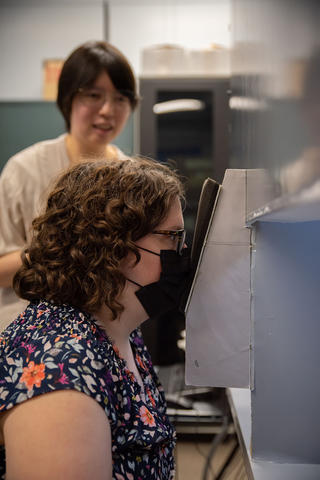
Jane then showed me to the booth where my color perception would be put to the test. First, I had to pass a test of my color vision and an additional test to check that the blue light filter on my glasses wouldn’t impact my color vision. I passed both with, um, flying colors.
The room was dark so as not to interfere with my vision. I sat in a chair in front of a viewing booth divided in half. I had to put my nose directly up against the cardboard center line of the booth (while wearing a mask for cleanliness). The two sides of the booth had the same background color (gray) but different lighting levels.
After a period of adaptation, the brightness I perceived on the two sides gradually converged. After adapting my eyes to the gray background, Jane placed one square sample of a certain color on the one side of the booth (with less light). The other side had more light, and she placed a board with 20 similar color samples there. I had less than 10 seconds to identify the closest match from the 20 samples. The time limit prevented my eyes from adapting to the sample color other than gray. She switched colors, and we started again.
We did this for several rounds in different types of lighting. I stared at the gray background for a few minutes in between rounds to reset my eyes. I felt pressure to choose a color match quickly. It was like when the eye doctor asks “A” or “B” or “1” or “2” during your eye exam. But it was also a fun challenge.
I told Jane that yellow was a particularly challenging color for me to match. The yellows all looked like the tiniest bit of difference in shades of a highlighter to me. That may be one way my color perception is different from others’.
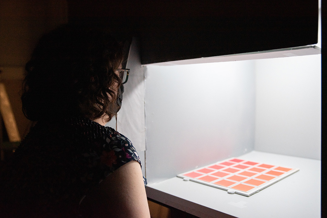
The second round was easier. We used just one side of the booth, and Jane handed me the same square and coordinating color card with 20 shades of that color. I had to match them up without a time limit. This was much more enjoyable — like matching paint colors to a sample at the home improvement store. I felt like my answers were closer to “right” than in the speed round.
But Jane explained to me after the experiment that there is no “right” answer, but there are answers they expect you to give based on the lighting in any given round. Jane said my answers were fairly close to what she expected.
I’m one of 20 adults who will do the same experiment over the course of the month. I asked Jane how they figure out the demographic breakdown of their participants. Jane said in her previous research, she found no real difference in color perception based on gender. Some other studies have shown women can outperform men in distinguishing subtle color differences.
Jane explained that there is some difference in color perception based on age, and the international standard for lighting is based on the eyes of a 32-year-old. While I’m a bit older than that at 39, I’m still close enough to the target demographic to offer useful data!
Setting the Standard for Modern Lighting
One of the measurements used to test lighting is the Color Rendering Index (CRI), which measures how light affects the appearance of colors in relation to an incandescent lamp or daylight. If a light has a high CRI, the colors you look at under that light should look close to how they appear under an incandescent bulb or outside.
The challenge, Yoshi explained, is that the CRI doesn’t match up to what people perceive.
When Yoshi showed me my face under that harsh lighting, that was a 95 on the CRI. The much more flattering lighting was only a 70 on the CRI. This is not necessarily surprising, as the standard was set 50 years ago before LED lighting was invented.
This has been the focus of Yoshi’s research — understanding the gap between the standards and people’s perception and updating those international standards to match what people see.
Jane will use the results of the study to create statistical models that could influence future international standards for lighting. Organizations such as the American National Standards Institute (ANSI) and the International Commission on Illumination (CIE) publish standards on everything from the color range of white light that is acceptable for your home to the methods of evaluating color rendering (like CRI) that are suitable for various lighting uses.
I’m glad to know I may play a very small part in updating lighting standards to fit our modern preferences and today’s lighting technology.
NIST’s research is probably already reflected in your home or workplace’s lights, and this research may help illuminate everyone’s path toward better lighting in the years to come.